Apple’s Liquid Glass: Polishing the Same Pane
Grafik Paragraph #50: Apple's WWDC and Liquid Glass, Amazon's Brand Refresh, Airbnb 'Experiences' and Skeumorpic Icons, Framer AI Components
Hey, what's up.
Apple’s WWDC just landed.
With their biggest UI redesign in 10 years—Liquid Glass.
Innovating is hard, and Apple is getting old.
Senior citizens hoard cash and take less risks.
Stock buybacks replace R&D budgets.
Buffett knew before all of us.
- Mon
.
.
State of the Craft: In fiscal year 2023, Apple spent $77 billion on stock buybacks—more than twice its $30 billion R&D budget.
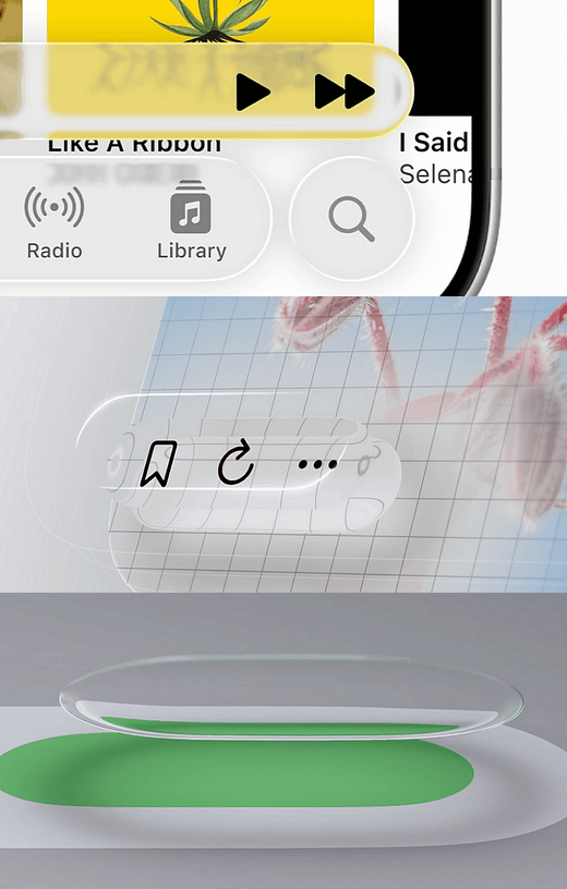
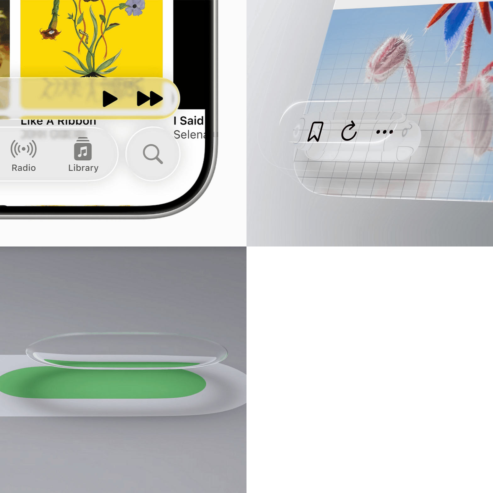
Apple Liquid Glass
Liquid Glass is Apple’s all new (glassy) look for its operating systems.
Rather than regurgitating Twitter’s “Liquid Glass is meh” takes, I’ll take another tack.
One which can help explain why Apple’s products and design don’t feel like they’re getting much better.
The S curve of innovation. Innovations follow predictable patterns: Most new technologies struggle initially, take off, then plateau.
I believe we’re reaching that plateau with the iPhone, know as “paradigm paralysis”.
And that’s why Liquid Glass feels like Apple polishing the same pane over and over.
Amazon Refresh
Amazon’s brand has long been a big, messy mix of endless sub-brands, confusing logos, hideous UI, and bland creative.
What’s interesting is it never mattered. Design is valuable and cool right, I’m sure I’m preaching to the choir here, but it isn’t everything.
Bring incredible value to consumers and you can create a dent in the universe.
As the company matures, design’s clearly getting more attention, leading to this refresh.
I wonder what Koto charged for this one. Can you fucking imagine? If anyone’s got gossip, share with ya boy, ok?
Airbnb App and Icon Redesign
Airbnb’s expansion into ‘experiences’ came with a redesigned app and some interesting icon designs.
They’re bringing dimensional UI back, you may have forgotten (like I certainly did), that we’ve been here before.
Also known as Skeuomorphism, early digital design was full of this playful 3d aesthetic.
Of the new design language, Brian Chesky, Airbnb’s CEO (A rare designer/ founder combo) had this to say.
“The future of tech isn’t flat—it’s multi-dimensional, personal, and more immersive than ever. We’re building interfaces that truly understand you, not just chatbots. The next era is about depth, not just data.”
Framer Workshop
We’re big fucking Webflow nerds and users over @ Toil Studio, insufferably so, I even flew my ass all to SF last year just for their 2 day conference.
But it warms my cold, dead heart to see Framer, their closest competitor, really pushing the no-code space forward.
AI-generated components: a rare genius idea that just makes sense (and makes you wish it was yours). Don’t do the layouts for me, but make the smaller building blocks—YES.
They’re years behind, but they’re aiming for the jugular with every innovative, thoughtful, and differentiated update.
Web Watch
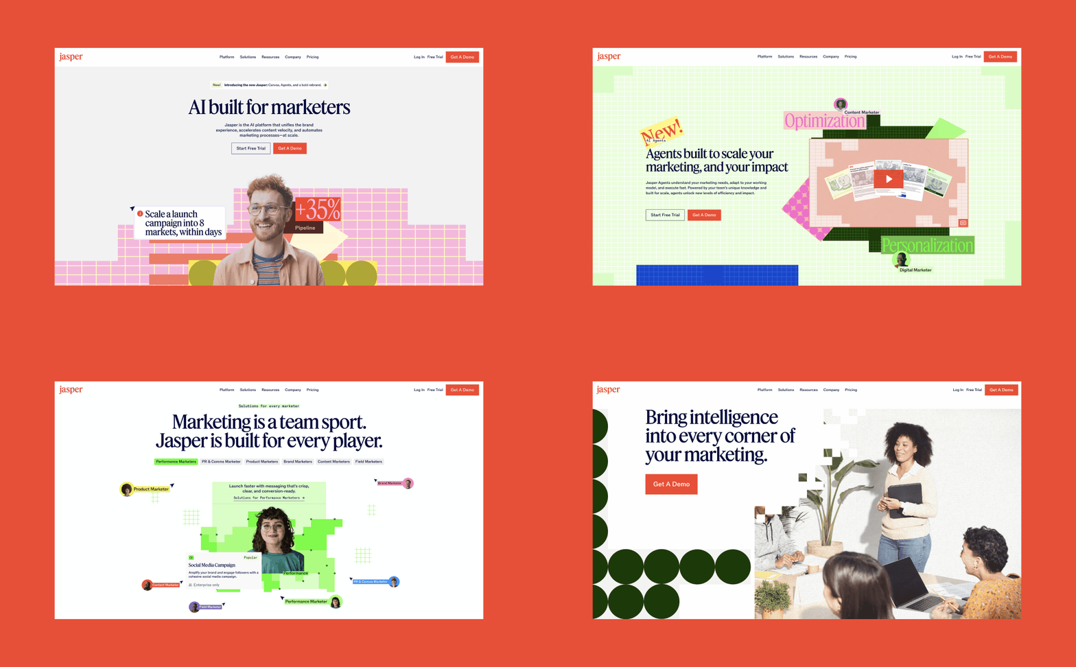
Jasper AI
Recently rebranded, Jasper AI has one of the largest and most robust Webflow websites out there.
.
.
Inside Access Below
💬 Extended interviews with bonus insights
📁 Templates, tools, and resources
🧠 Behind-the-scenes at Toil
⚙️ Personal workflows and systems
Keep reading with a 7-day free trial
Subscribe to Grafik Paragraph to keep reading this post and get 7 days of free access to the full post archives.


